
Sorry, but since I migrated to Squarespace, I there is no Part 2 to this article, as originally intended. Maybe in the future though.
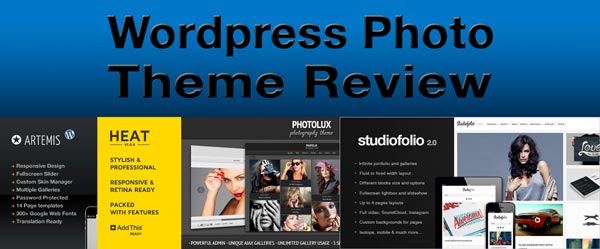
Wordpress.org calculates that over 60 million websites are powered by their platform. Sure, Wordpress has grown up a lot from its roots as mere blog software. You now see it powering everything from virtual business cards, to web stores, to fashion portfolios and photography sites. Each group has different needs, and in most cases the basic Wordpress themes are not going to cut it (I'm looking at you, Twenty Twelve). So most people will turn toward one of the 3000 or so premium themes available. Most of those cost $30-50 and require significant setup. So while you don't have to be locked into one theme forever, you'll still want to choose carefully.
I'm going to focus on photographers here, but designers and visual artists can also benefit from many of the templates I'll discuss. The reviews will of course be tailored to my own sensibilities. I believe the design should:
BE MINIMAL
I'm entranced by shiny objects as much as the next guy, but flash websites can be a problem. Don't let the interface distract from the photos. Prospective clients need to be able to find their way around your site, so lots of animations and menu choices can impede navigation.
FOCUS ON THE IMAGES
As part of a minimalistic design, you should be displaying your work in a way that doesn't overload the viewer. Tiled/masonry style portfolios are very popular at the moment, and can look great, but consider using this for your overview page, and having individual shoots/projects go to a page that displays single images in a slideshow or lightbox format. This is more important for landscapes and fine art photography than for portrait shoots, where you might prefer the collage look.
A note about lightboxes: for the love of all that is good, don't use the classic Wordpress style lightbox with the white-bordered image popup. They don't black out the background, so it's still there to distract you. There are a number of slightly improved derivatives out there, but they still look ugly. Many of them have animated window-resizing transitions which also violate the minimalism principle. I actually recommend Wordpress's own Jetpack plugin, which will upgrade your gallery with a slideshow that clicks through to an attractive, distraction-free lightbox.
By the way, fullscreen sliders can be impressive, but they will crop and thus mess up your vertically oriented images. I favor themes that CAN display fullscreen, but accomodate portraits as well.
MOBILE IS IMPORTANT
The mobile (phone and tablet) market is huge. Let's say you're chatting up a prospective client; you want to be able to bring up your portfolio on your phone. You're going to need a site that displays well, or at the very least does not cause migraines when viewed on the smaller display. This means that those fixed-width layouts and Flash have got to go. Fluid layouts (where images and text can expand to fill the window) are good for larger screens, but what you really want is a responsive layout. Responsive designs allow page elements (widgets, content, header) to reorganize and flow around each other and smaller screens.
My current theme, Studiofolio, is responsive, but a little slow on mobile. So I use the WPTouchPro plugin to provide an optimized experience for those users.
BE QUICK ABOUT IT
Remember how I cautioned against excessive animations? Those are not just distracting, but they impede performance, especially on mobile. I've seen a lot of cool themes that, much to my surprise, were also responsive and thus mobile-compatible. But it was all too much Javascript for my iPhone to handle.
If your pages load too slow, it might cause readers to give up and go elsewhere. Google also takes loading speed into account so you will rank lower in search results!
One way you gain a little more speed is again to use Jetpack. The Photon module will serve dynamically resized images from Wordpress servers. It can be quite helpful, although I've noticed the relinking and resizing of your images can sometimes interferes with plugins (at one point Photon thought that the 1000x1000px images for my slider were supposed to be thumbnails. Visitors saw a 150x150px image stretched to near-fullscreen.
TO SUMMARIZE:
- BE SIMPLE. BE ELEGANT.
- MAKE YOUR IMAGES STAND OUT.
- MOBILE IS IMPORTANT.
- SPEED IS INCREDIBLY IMPORTANT.
Review Criteria
I use a 5-point scale: 0 (Broken) to 5 (Superior). 3 denotes Average.
Style: Is the overall design clean, and does it let you focus on the images? Or is it mired in lots of flowery animations? Is there compelling typography? How do the galleries and portfolios look?
Navigation: Are things like buttons consistently styled? Is it readily apparent what a button does based on its icon? When you enter a lightbox, can the back/close button be found near the navigation buttons you were previously using, does it move or change appearance so that the user has to hunt for it? Also, do galleries support keyboard input, mouse wheel scrolling, and touchscreen swipe gestures?
Post Options: Do portfolio items support text and links? Points for having multiple post/page/portfolio formats.
Editing Tools: How many shortcodes are provided, and is there a shortcode generator in the Visual Editor (ie TinyMCE)? Is there a drag and drop 'visual composer'? Does it support the WP3.5 media gallery, and mass uploading of images?
Support: Can the author be easily reached? Is there a dedicated support forum? Are there frequent updates (at least 1 per month)? Is there good documentation and how-to videos? Bonus points if the theme has been around for more than two years and is still receiving updates. Extra extra points if it has received significant functionality upgrades in that time (like adding responsiveness to what was originally a fixed layout).
Themes
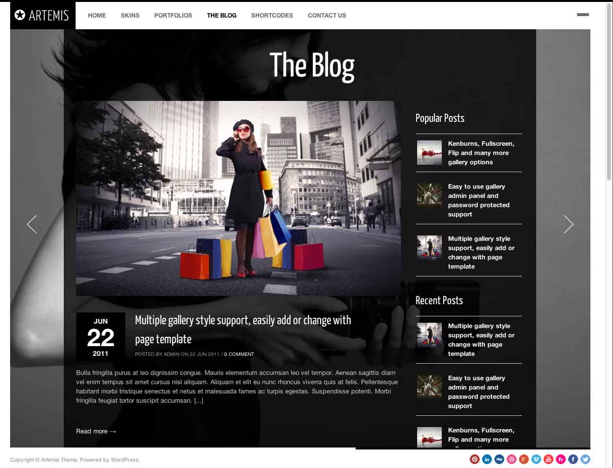
Artemis
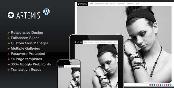
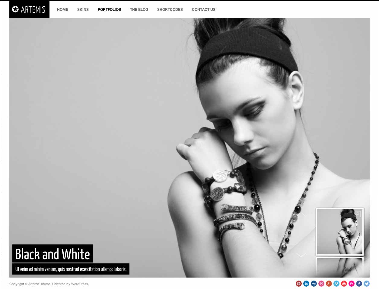
Best for: Fashion, landscapes, videographers
Responsive: Yes
Cost: $45
Style: 3/5
Navigation: 2/5
Post Options: 4/5
Editing Tools: 4/5
Support: 4/5
Overall: 3.4/5
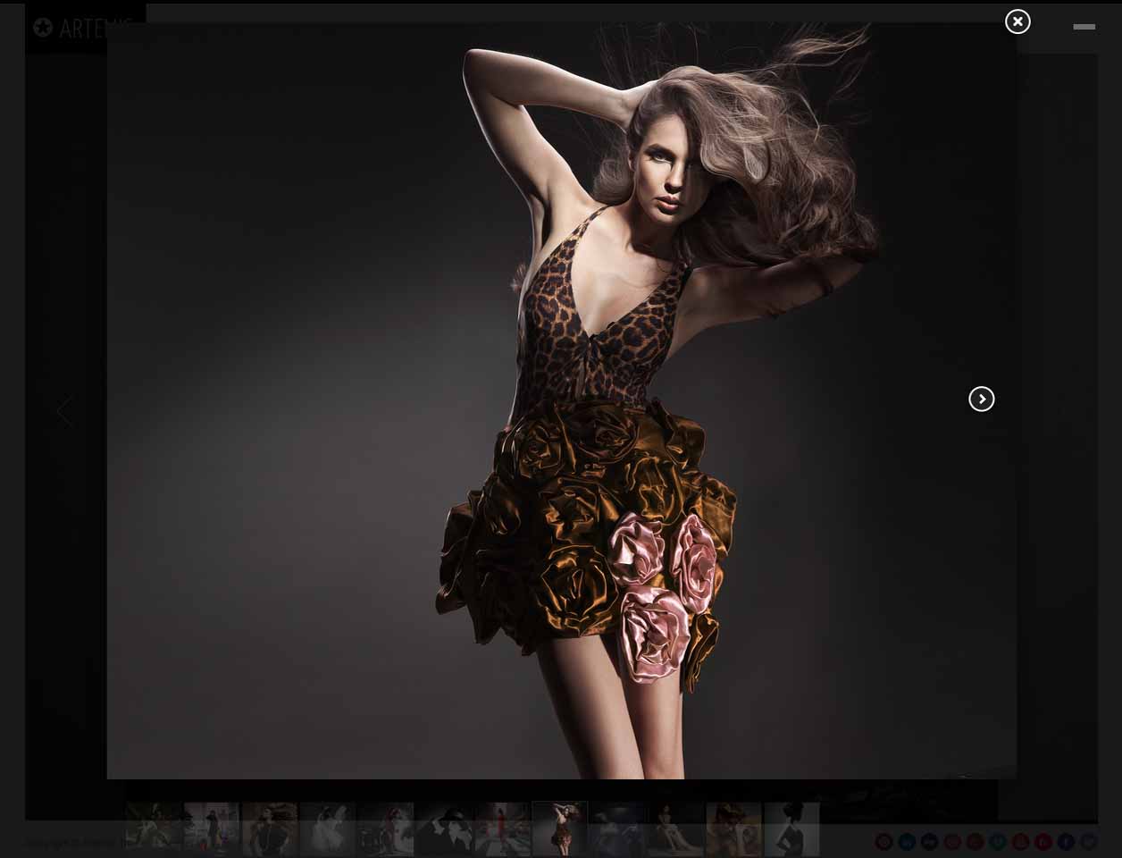
This is one of many themes put out by a fellow named Peerapong Pulpipatnan. I've browsed his works, and they are all solid, well supported, and cleanly designed. However, his themes generally don't have the best sliders or portfolio presentation. Artemis only offers fullscreen sliders. There are several choices, but none seem to be suitable for vertically oriented portraits. As for the sliders, the image flow slider might be acceptable to some but doesn't support keyboard and when zoomed in you also lose the ability to navigate to adjacent photos. It just requires too much clicking. There's also the flip slider, but I think it looks a little weird.
It's hard for me to comment on how the portfolio post type works, since all the examples use video. I'm fairly certain it will work with photos, displaying them in the same slick lights-out style lightbox that he provides for galleries. However, for portfolio posts many of us would like to provide some text and links to the project. There's no option for that.
Bottom Line: Lots of good ideas here, but the wonky mouse scroll in one of the sliders is annoying. Most of the scrollers are for landscape-format images, resulting in the cropping of your portraits. It would also be great if Peerapong had a standalone support site; he certainly has enough themes to justify one.
Studiofolio
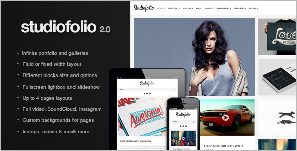
Best For: Anyone
Responsive: Yes
Cost: $40
Style: 5/5
Navigation: 5/5
Post Options: 5/5
Editing Tools: 3/5
Support: 5/5
Overall: 4.6/5
Full disclosure: This is my current theme. I hope I don't sound biased.
This is a very new theme that reflects a new trend in WP design. The layouts are very clean, and you have the option of vertical or horizontal navigation bars. That's a rarity, not only for having a choice, but also because it was added after release.
There are some very attractive Flexslider and Isotope-powered galleries. Isotope is a masonry-like tiled gallery where you can assign each thumbnail to have a different size. There are useful next/prev/share buttons throughout the site. They are consistently styled, but their function might not be apparent to some users. I'd prefer text instead of the icons. It has a good range of shortcodes, but just the basic ones like columns, tabs, and accordion
The two dev's respond promptly via email and their support forum. I've already seen an update that incorporated one of my suggestions, where they realized they had made a bad decision (to alter the default gallery shortcode behavior) and reversed course. The product was only released two months ago, so we'll have to see how long term support goes, but so far they've released an update every 1-5 days. Quite impressive. I think it helps that they only have two themes to support at the moment (Egofolio being the other). By contrast, Peerapong has 42 themes, which I think is too much for an individual or small team to support effectively, and leads to each item looking like a variation on the other.
There is however a downside to the support site: the site is hampered by lack of organization and search features. So while you'll be able to follow responses to your own question, it is very hard to track similar issues in other threads; other posts will quickly be buried. I also noticed a bug where many posts appear twice in the search results.
The only issue I have with Studiofolio is the speed. It uses A LOT of Javascript (jQuery and AJAX) to give you that I-just-kissed-a-unicorn warm fuzzy feeling. AJAX is great, because a page doesn't have to be fully reloaded to show new content (as when a new comment is posted to a blog, or when you navigate to a new page). It SHOULD result in more speed, but either the AJAX implementation, or the javascript in general really bogs things down. Not much of a problem on a fast desktop, but my galleries can load quite slow on my iPhone 4.
Bottom Line: I love this theme, I just wish that it was coded more efficiently for mobile browsers. The support site is awesome; there you can find lots of code snippets there that allow you to customize to your heart's content. Even if you don't like it, I advise you to keep an eye on this one, I'm pretty sure it will continue to evolve by leaps and bounds.
Photolux

Best For: Anyone
Responsive: No
Cost: $45
Style: 5/5
Navigation: 2/5
Post Options: 5/5
Editing Tools: 4/5
Support: 3/5
Overall: 3.8/5
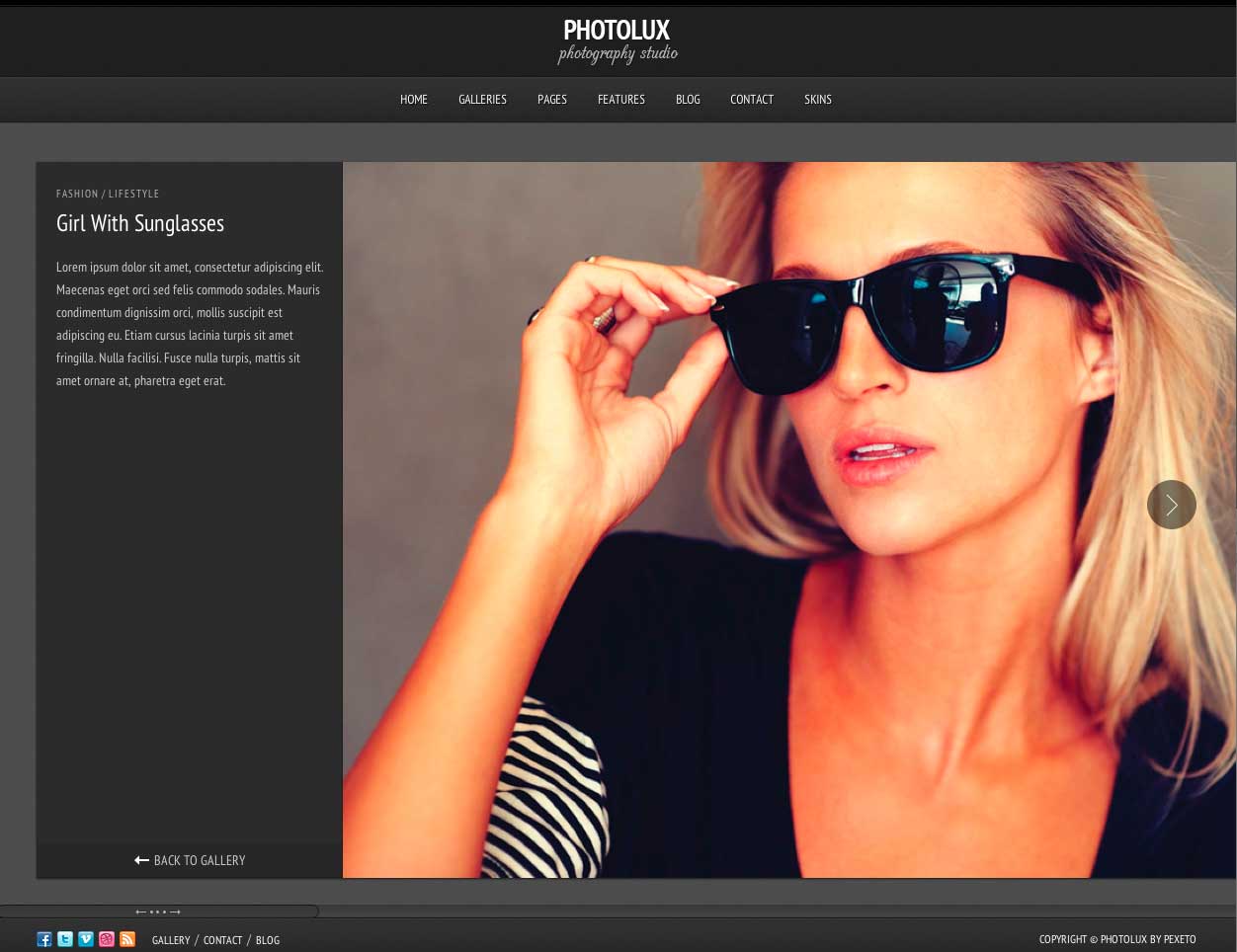
This is one of the few non-responsive themes I'm covering, just because it deserves recognition for its innovative portfolio slider design. I really like the design of the portfolio pages: very clean, and you can introduce the project with a small text area. Users will see this first, and then be able to scroll past it to view the images. Many other themes give you the text area, but users with smaller browser windows might not see it without scrolling. Photolux's one-of-a-kind slider just nails it. I would like to see others implement because it easily accomodates either portrait or landscape images. The only one that's like it is in Heat.
Too bad the portfolio slider goes completely crazy with scroll wheel and also doesn't support keyboard input!
I really don't understand why Pexeto hasn't implemented the slider in their newer themes like Expression.
They have an active, dedicated support forum which is publicly browsable. You can also find theme documentation online (though it seems to be dated from 2011).
Bottom Line: Pass on this one, but if Pexeto ever fixes the bugs in their portfolio slider, this might be one to try. Keep your fingers crossed that their either update it for 2013 or incorporate its best features into a new product.
Heat

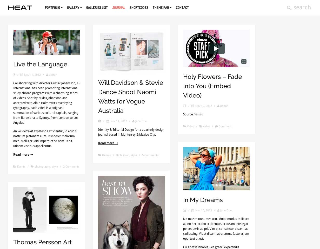
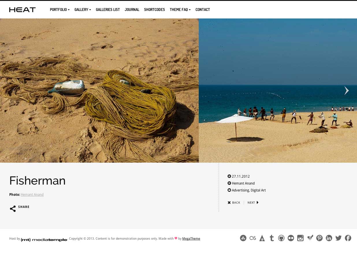
Best for: Masochists, Sisyphus, and millionaires with their own dev staff
Responsive: Yes
Cost: $40 (the pain: priceless)
Style: 5/5
Navigation: 5/5
Post Options: 4/5
Editing Tools: 1/5
Support: 0/5
Overall: 2/5 Buyer beware.
You might have noticed that the math was overridden to give this one a final score of 2. That's because, like Icarus, Heat manages to fly high, only to inevitably fall far below expectations.
Heat has a number of excellent sliders, with keyboard, scroll wheel and touchscreen support. The iOSslider reminds me a lot Photolux, and is a really superb method of displaying portfolio items, and accommodates both portrait and landscape images.
However, you'll quickly realize the developer MegaTheme is all talk and little substance. The theme was released February 5th, 2013, but as of March 15th, visitors to the MegaTheme website will find nothing but a placeholder logo. Their Themeforest profile also lists Facebook and Twitter pages, but both are empty: no content, no posts. What the heck is going on?
I tried to get in touch with the developer to answer my pre-sales questions. Unfortunately this could only be done through Themeforest. With so little info available, I wanted to see if they had posted their manual online, as many developers now do. Around March 1st, I emailed them through Themeforest, and after several days they responded no.
By this point, any sane person would have given up and moved on to the next best option but it cannot be understated how much I loved that portfolio layout. I figured, "Their promotional documents were written with a lot of care, and they say they have good documentation. So what if it's not online? Besides, it's hot-off-the-presses. They'll probably get everything up and running soon enough. I bet it'll all be fine." I bought it.
And immediately had problems, little issues with alignments, slider malfunctions, etc. That's not unusual with applying a new theme, and is usually not a big deal provided you can obtain support. But there was none forthcoming. Now that I could read the documentation, I found it surprisingly basic, with no explanation of custom post types or other theme-specifics. NOT EVEN THE AUTHOR's EMAIL. This individual certainly doesn't want to render you any support. Further attempts to contact them via Themeforest went without reply.
I managed to talk Themeforest into a refund, but you must keep in mind that Themeforest has horrible customer service, and doesn't give a fig about matters such as customer satisfaction. I left a comment on the item's TF page to warn other users of my experience (no, it wasn't a rant) and this was taken down by TF. I can only assume because they'd rather take people's money than protect their customers and their reputation.
Bottom Line: AVOID. There's an awesome theme in there somewhere, but it doesn't matter how pretty it is if you get no support. Let's hope that MegaTheme gets their act together someday. Oh, and did I forget to mention that it doesn't support the WP3.5 Media manager, or uploading multiple images at a time?
In Conclusion
This article proved to be a lot of work, but I think it's worth it in the end if I can help other photographers and designers. I managed to address four themes out of the 24 I plan to discuss. Please stay tuned, and Subscribe by Email (or to the newsletter) if you'd like to know when the next article is posted.
Please tell me your thoughts and experiences in the comments an suggest themes for review.
The idea for this came from a post in the San Francisco Photography Group on Facebook. Thanks go to Alex Win for reading my draft. For more, you could also see Tripwire Magazine, which posts lists of all the hot themes. They don't do any reviews, though.